
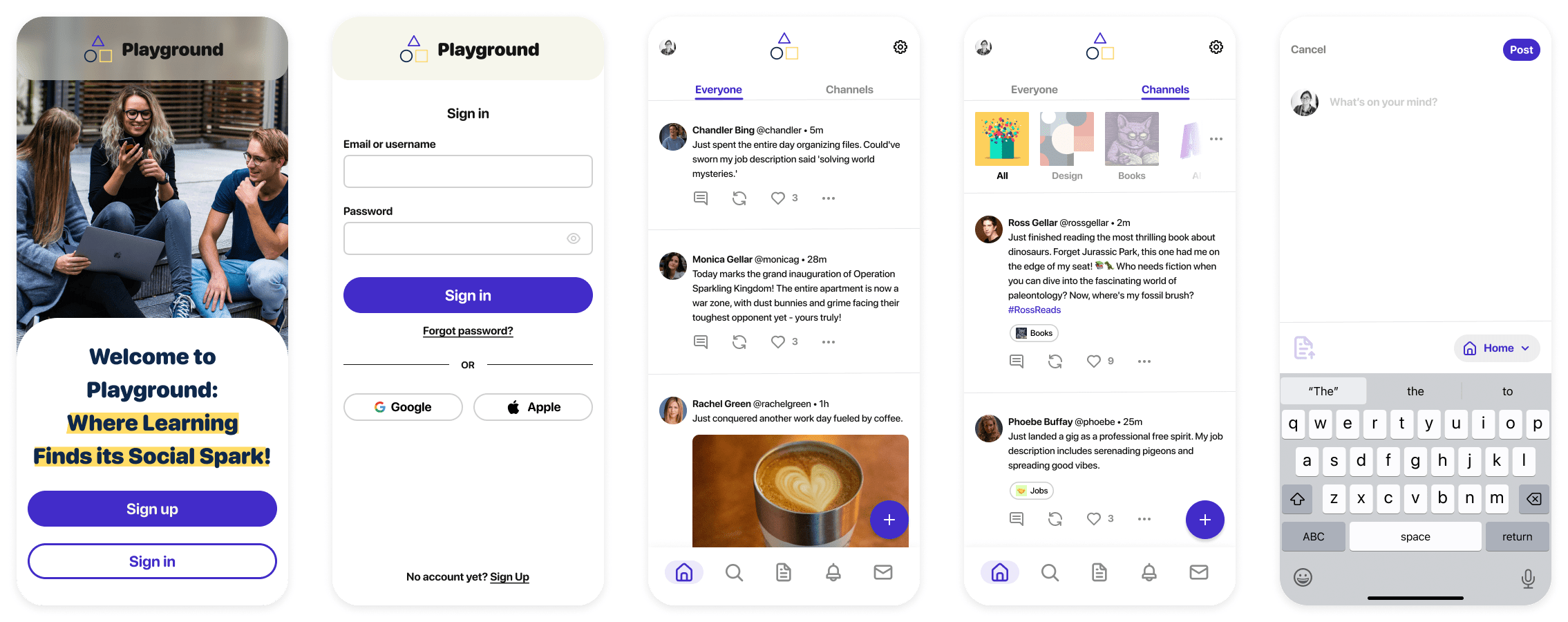
Playground – where learning finds its social spark!
OBJECTIVE
Connect students online to facilitate peer-to-peer learning, support, feedback, and motivation.
ROLE
UX/UI Designer
RESPONSIBILITIES
Wireframes
Mood board
Mockups
Style guide
Prototypes
DURATION
2 months
User Flow
The flowchart was crafted utilizing the user stories supplied, serving as a roadmap during the wireframe design phase.
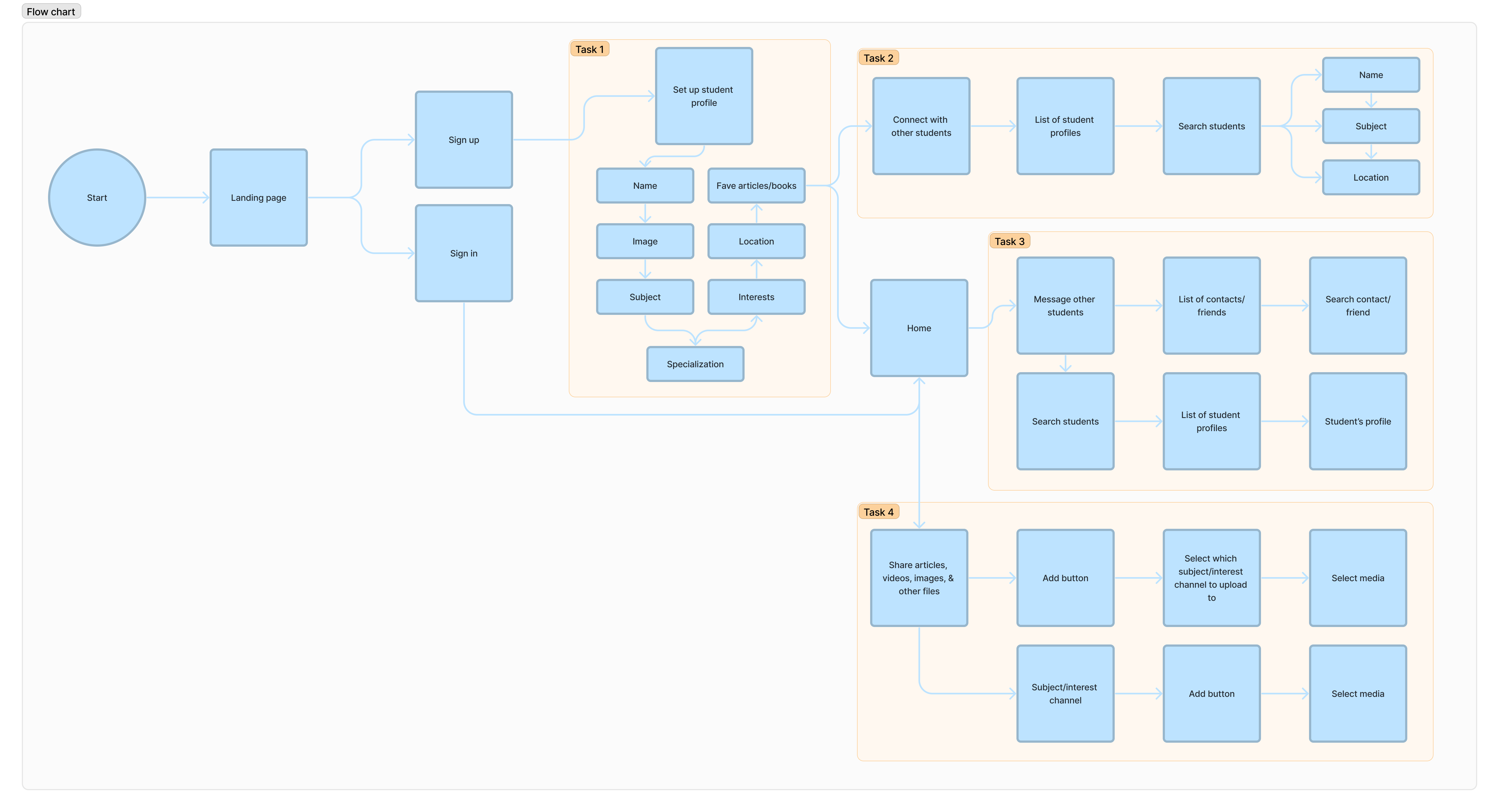
Task 1:
“As a new user, I want to create a profile, so that other students can find me.”
Task 2:
“As a new user, I want to find and connect with students studying my subject (or a related subject), so that we may collaborate.”
Task 3:
“As a frequent user, I want to be able to message other students, so that we can problem-solve together.”
Task 4:
“As a frequent user, I want to be able to view and share articles, videos, images, and other files, and write posts for other students to read, so that we can share knowledge.”
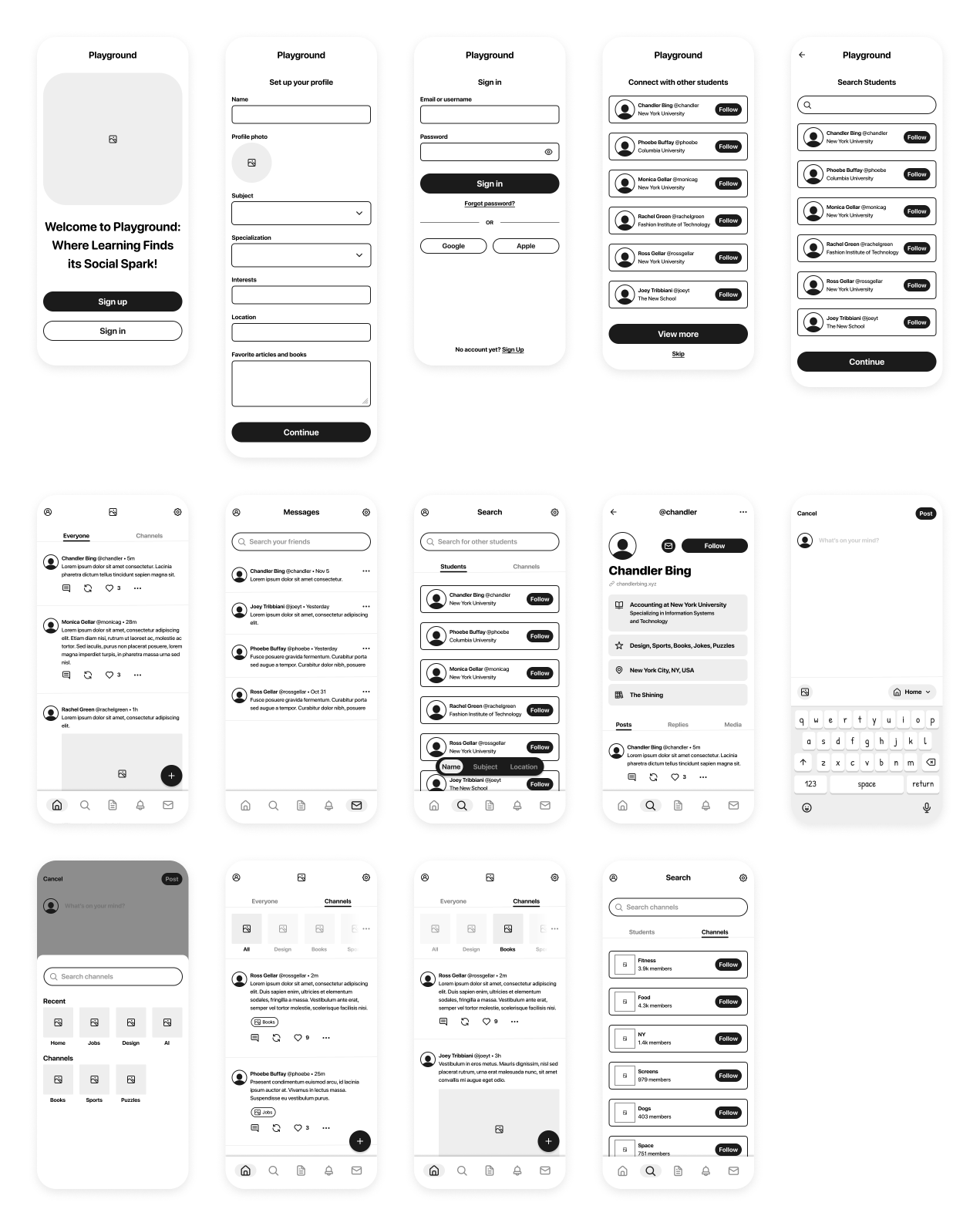
Low & Mid-Fidelity Wireframes
Initially, my focus was directed towards crafting the mobile screens before transitioning to the tablet and desktop interfaces. These low and mid-fidelity wireframes enabled rapid idea testing, refinement, and feedback collection.

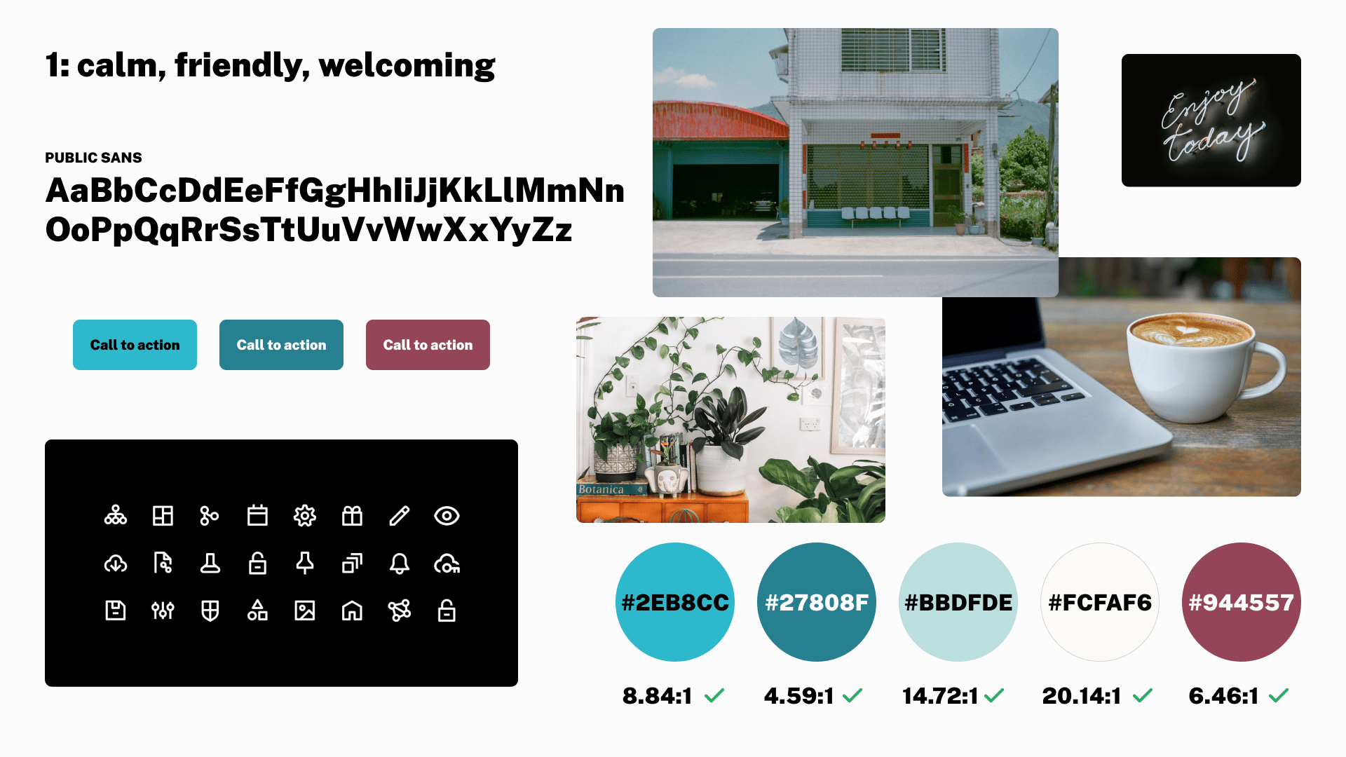
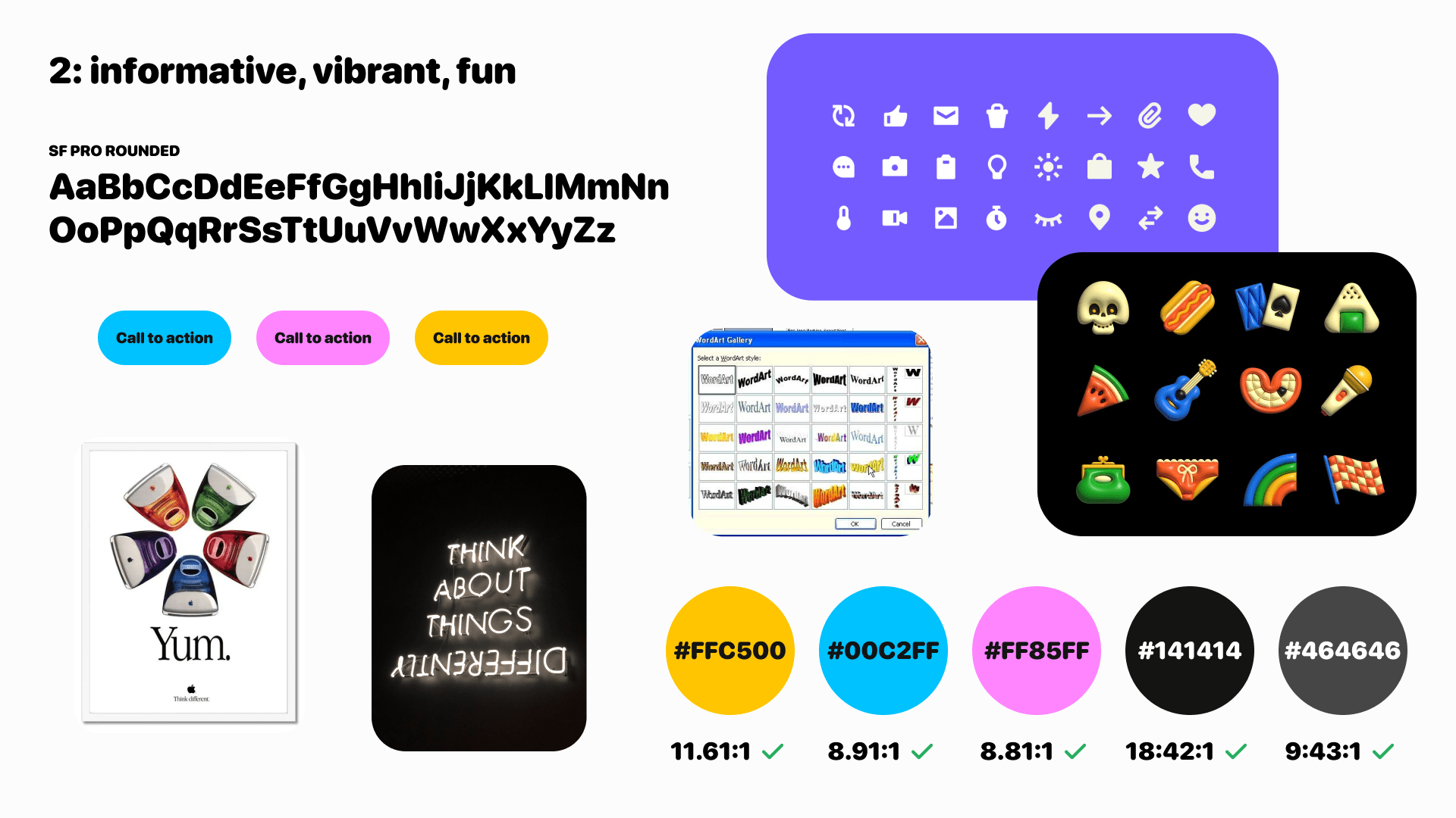
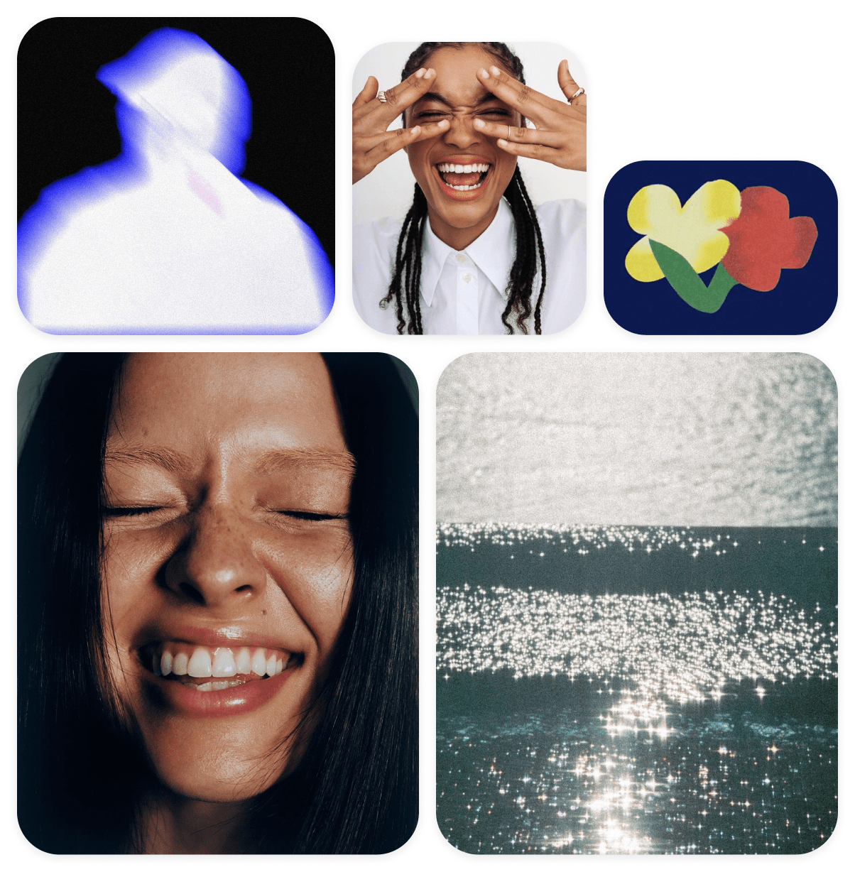
Mood Boards
To explore my options, I created two mood boards. Initially, I chose to proceed with mood board 2, which exuded a lively and playful vibe that I believed would resonate well with students.
Style Guide
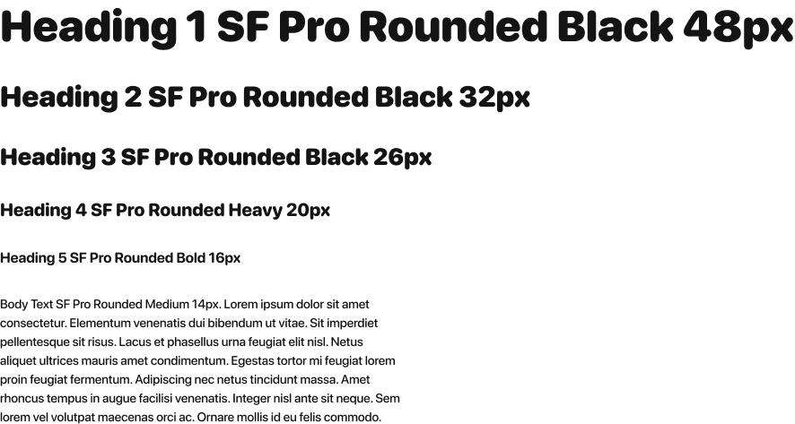
TYPOGRAPHY
Playground uses the sans-serif typeface, SF Pro Rounded. This font offers a softer and more friendly appearance, which is suitable for the vibrant, fun, yet informative vibe that the app aims to convey. This font works well across various screen sizes and resolutions, ensuring text remains clear and readable on different devices.
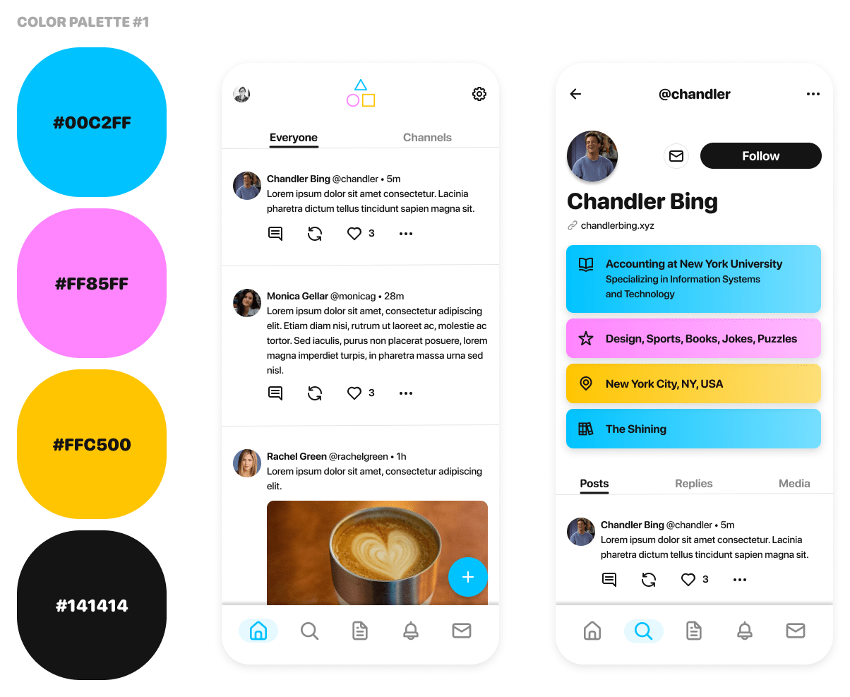
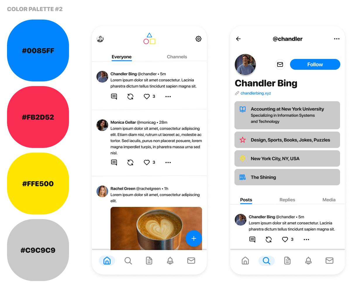
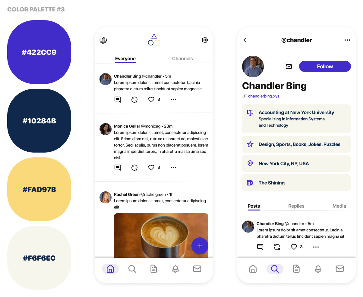
COLOR PALETTE
In maintaining a lively and informative visual style, Playground employs a diverse palette of accessible colors. Our primary color is purple, complemented by yellow as a secondary hue.

LOGO
The Playground logo is a combination of a wordmark with an icon. Please follow these guidelines to ensure consistency.
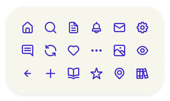
ICONOGRAPHY
Playground utilizes the Unicons icon set. The outlined/slightly rounded edges give the icons a light and playful feel, which blends well with the overall app.
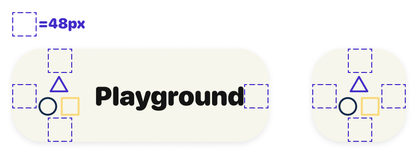
- Size: icons will be at least 24 x 24px with a 48 x 48px perimeter for accessible touch targets
- Color: #422CC9 or #141414
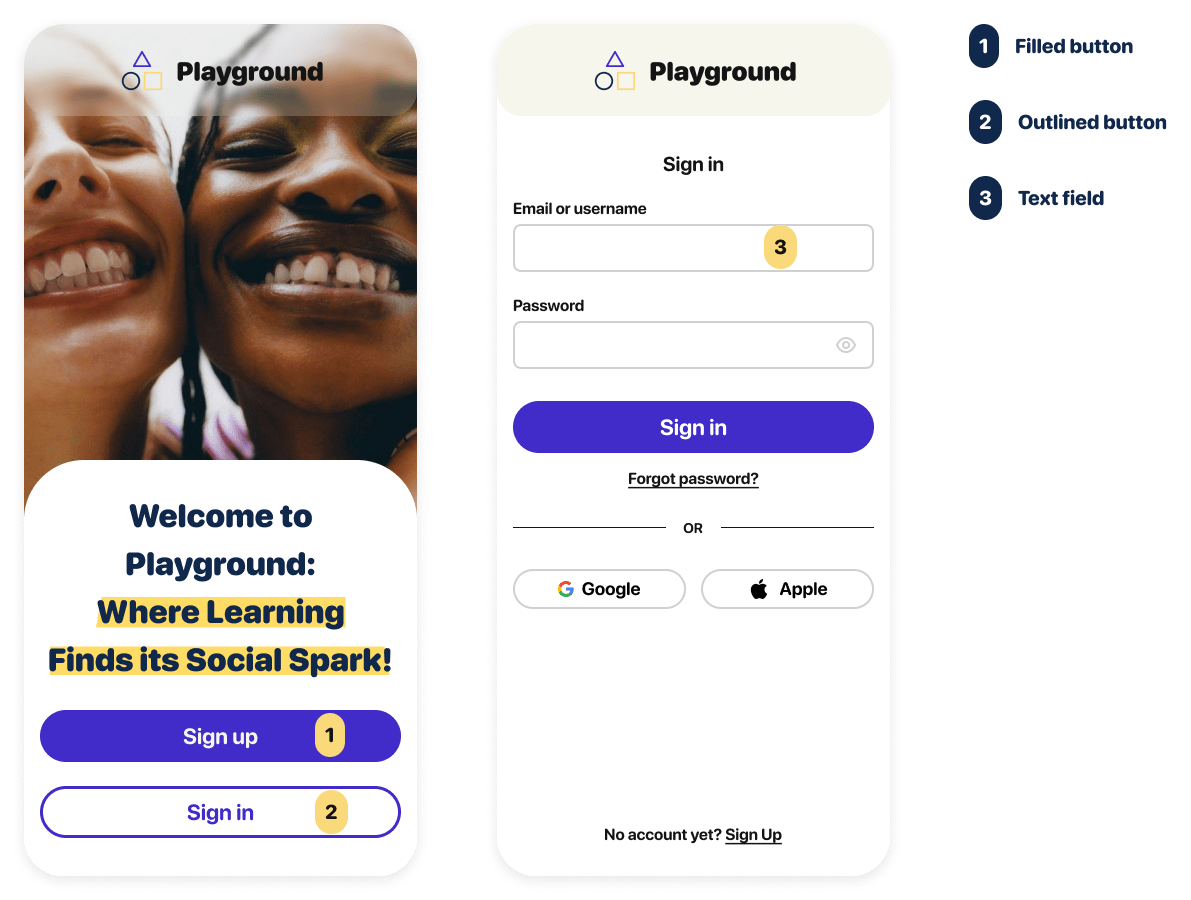
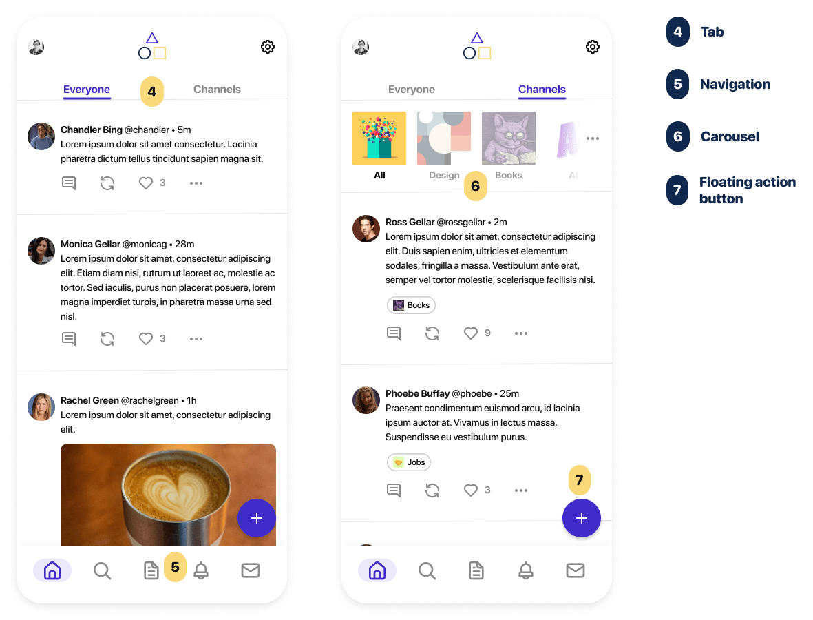
UI ELEMENTS
Here are the common UI elements utilized within Playground. Everything from buttons, text input fields, navigation, carousels, and more.
IMAGERY
The landing page of Playground will showcase a wealth of visuals. To capture the app's informative, lively, and enjoyable ambiance, I plan to incorporate pictures featuring cheerful young individuals, alongside vibrant illustrations, abstract imagery, and nature-inspired scenes.
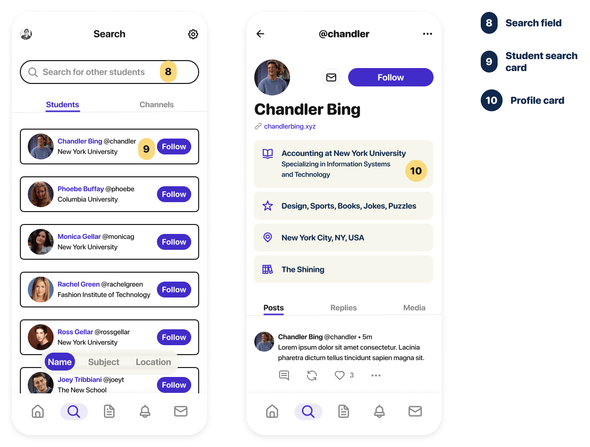
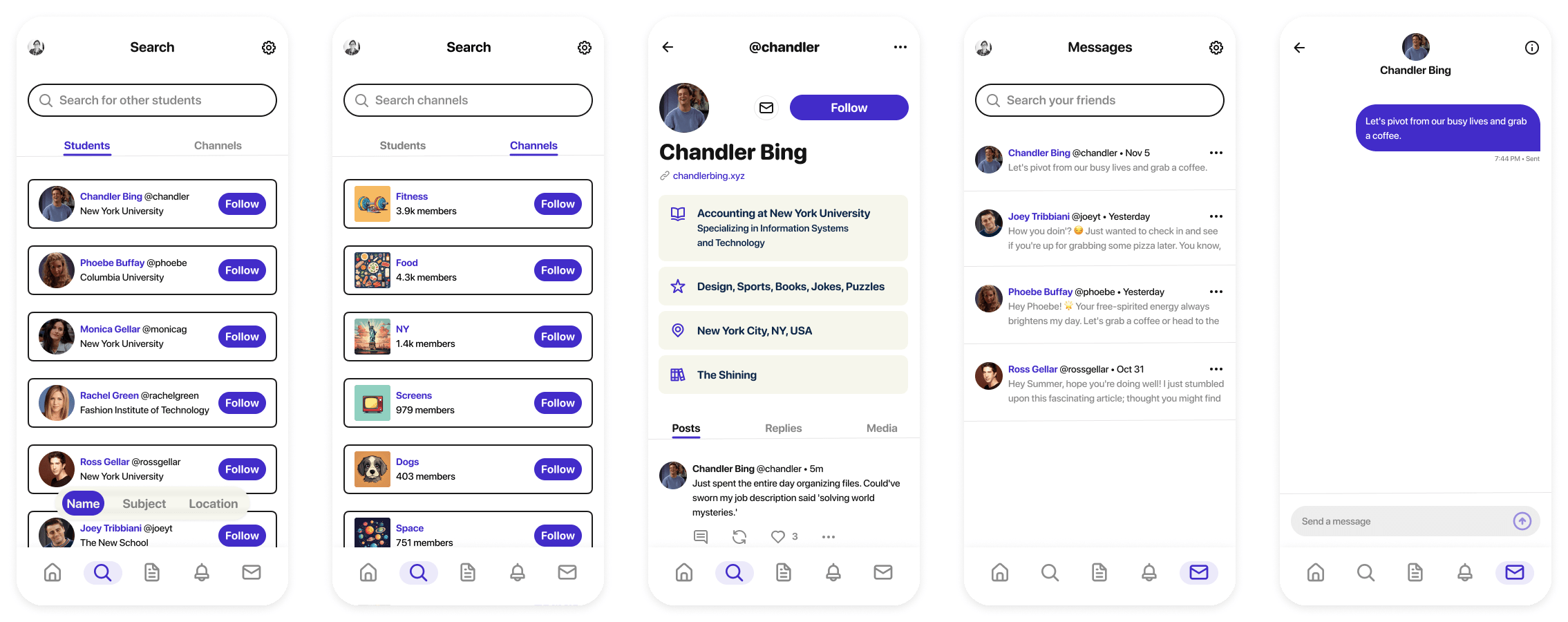
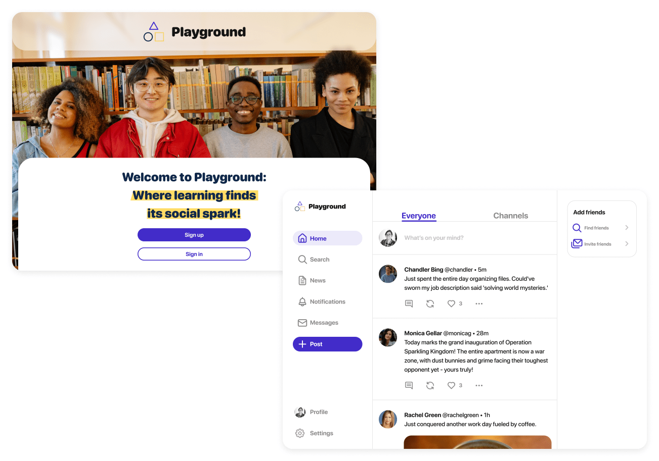
High-Fidelity Wireframes
Here are high-fidelity mockups across various breakpoints, including mobile, tablet, and desktop. They showcase several key tasks outlined in the user flows within Playground.
View mobile prototype →
TABLET BREAKPOINT
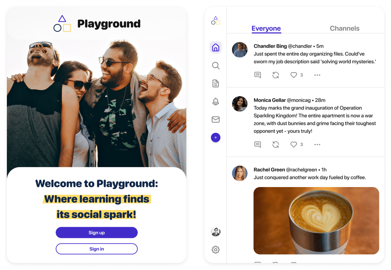
DESKTOP BREAKPOINT
Wrap-Up
LEARNINGS
- Understanding the problem and the user is essential for creating an attractive UI
-
Giving priority to accessibility can result in a visually appealing product
NEXT STEPS
-
Observe which features or design elements prompt the highest levels of engagement among students
-
Get insight into UI preferences among students, such as color schemes or layout structures
-
Identify any usability issues or pain points encountered by users while navigating the app
-
Evaluate how effective the app is in fostering a sense of community among students