 PlutoPay is a simple and secure app that allows users to easily access their money anytime, anywhere.
OBJECTIVE
Design a responsive web app that allows anyone to shop, transfer money, and more without a debit or credit card or the need to visit a physical bank or store.
ROLE
UX/UI Designer
Researcher
RESPONSIBILITIES
Competitor analysis
User research
User flows
Wireframes
Prototypes
Design system
DURATION
6 months
THE PROBLEM
Our users need a way to securely access and manage their finances wherever they are because they value convenience and want to stay in control of their money.
PROPOSED SOLUTION
Craft a simple, secure, and intuitive app that allows users to easily access their money anytime, anywhere. Users are able to receive rewards such as cash back as well as open their very own savings account. Users will also have access to budgeting tools to help manage their finances more effectively and achieve their financial goals.
Come along and see how I achieved this:
Competitor Analysis
APPLE WALLET
Apple Wallet is Apple’s app that lives on your iPhone and works with an Apple Watch. It securely stores your credit/debit cards, transit cards, boarding passes, tickets, car keys, and more all in one place.
Strengths
Simple value proposition. Prominent positioning in Google and Apple app store search results. Deep integration within the Apple ecosystem.
Weaknesses
Limited to the Apple ecosystem, excluding users of other mobile platforms. Users may be hesitant to transition from physical wallets to digital wallets due to unfamiliarity.
Opportunities
Apple can further strengthen partnerships to offer additional services and incentives. Potential to introduce new features such as enhanced loyalty programs.
Threats
Competition from other digital wallet providers such as google Pay and Samsung Pay. Security breaches, identity theft, or unauthorized access to user data.
CASH APP
Cash App is a mobile payment service that allows users to send and receive money using their mobile devices.The app provides a convenient and user-friendly way to handle financial transactions with features like peer-to-peer transactions, Cash Card, and Cash Boost. It also offers features like stock investing.
Strengths
Offers a simple and intuitive user interface. Seamless peer-to-peer transactions. Offers additional features like stock investing and Bitcoin trading.
Weaknesses
Limited international availability; only limited to the US and UK. Operates primarily as a mobile app, limiting those who prefer or rely on desktop or web-based platforms.
Opportunities
Can expand services and user base to new geographical regions. Can explore and introduce new features, services, or partnerships.
Threats
Other mobile payment services, traditional financial institutions, and emerging fintech companies that offer similar features and services.
User Research
To better understand potential users of PlutoPay, I chose the user surveys, user interviews, and contextual inquiries research methods. Combining these methods allowed for a comprehensive understanding of the users’ needs, behaviors, and preferences.
RESEARCH GOALS
• Understand the users’ behavior when using a finance app.
• Document user pain points with existing finance apps on the market.
• Determine specific tasks users desire to accomplish through a finance app.
• Recognize functionalities within a finance app that would capture users’ interest.
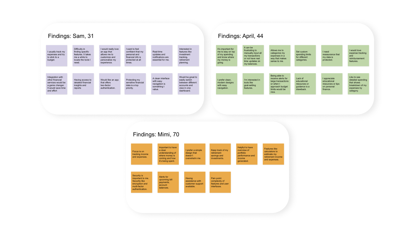
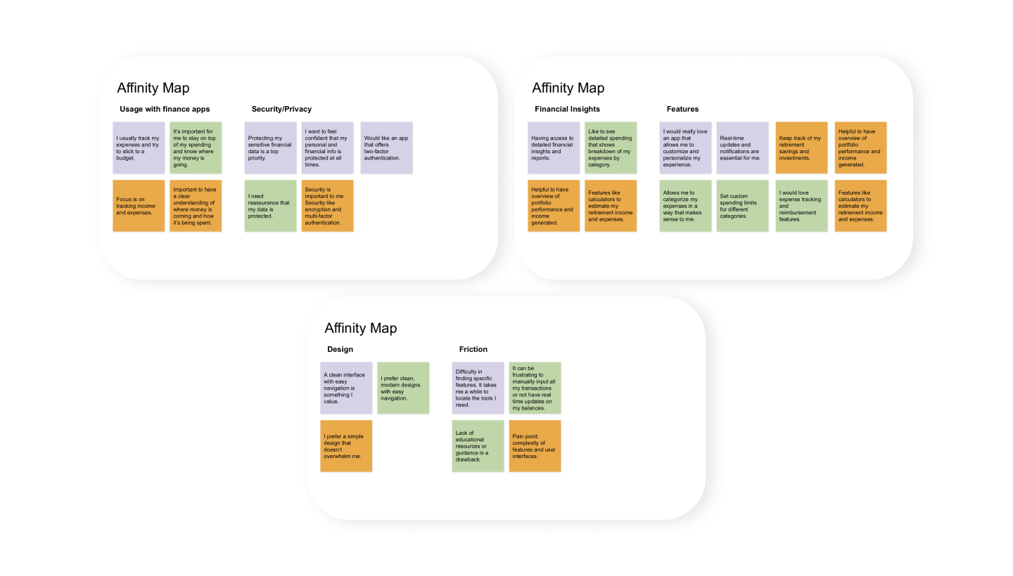
INSIGHTS
• Users primarily use finance apps to track expenses and income.
• Complex and cluttered user interfaces are a common frustration.
• Users seek strong security measures.
• Expense tracking and income management are top priorities.
• Budgeting and goal setting for saving and financial planning are desired.
• Features for retirement planning and investment tracking are highly valued.
• Notifications and reminders for bill payments are important.
• Users care about user-friendly interface with simple design.
• Encryption and multi-factor authentication.
• Reliable customer support.
• Seamless integration with bank accounts and financial institutions.
• Personalized recommendations and tips for financial management.
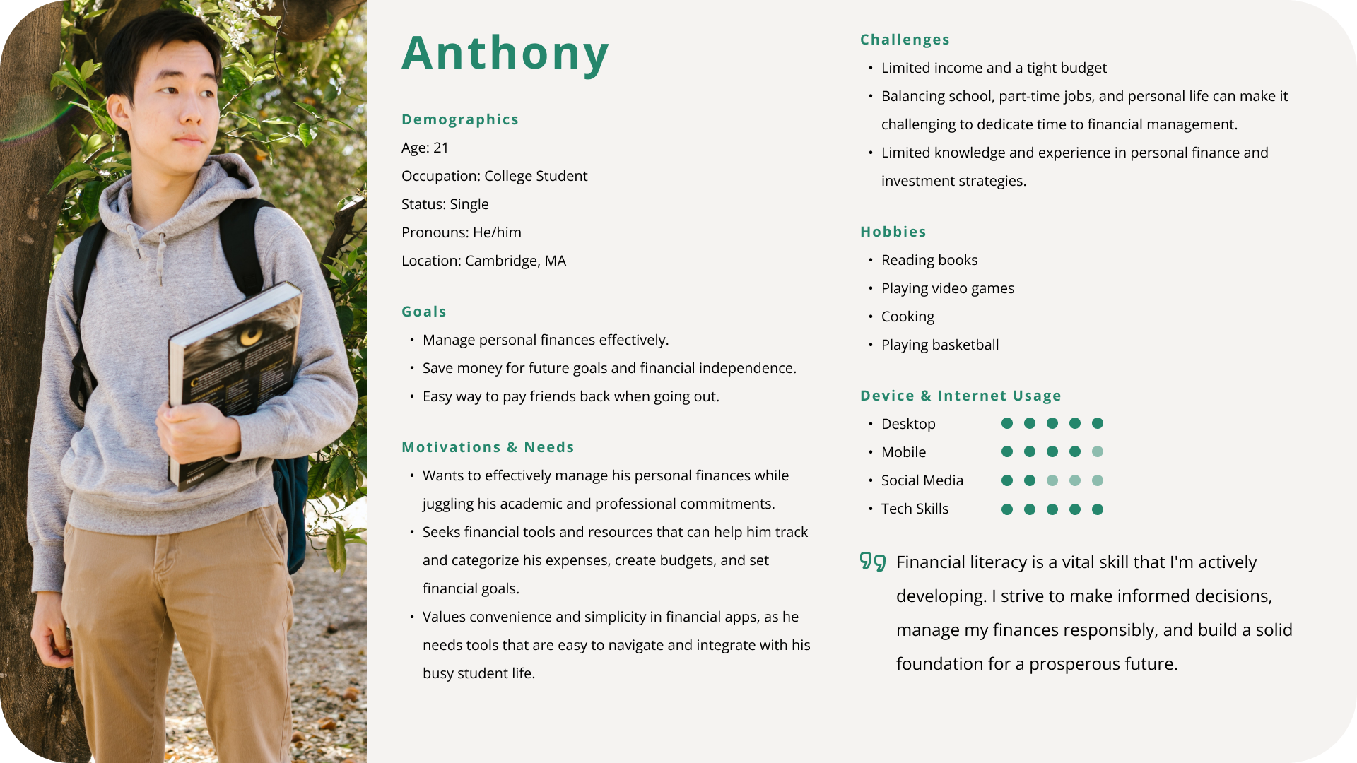
User Personas
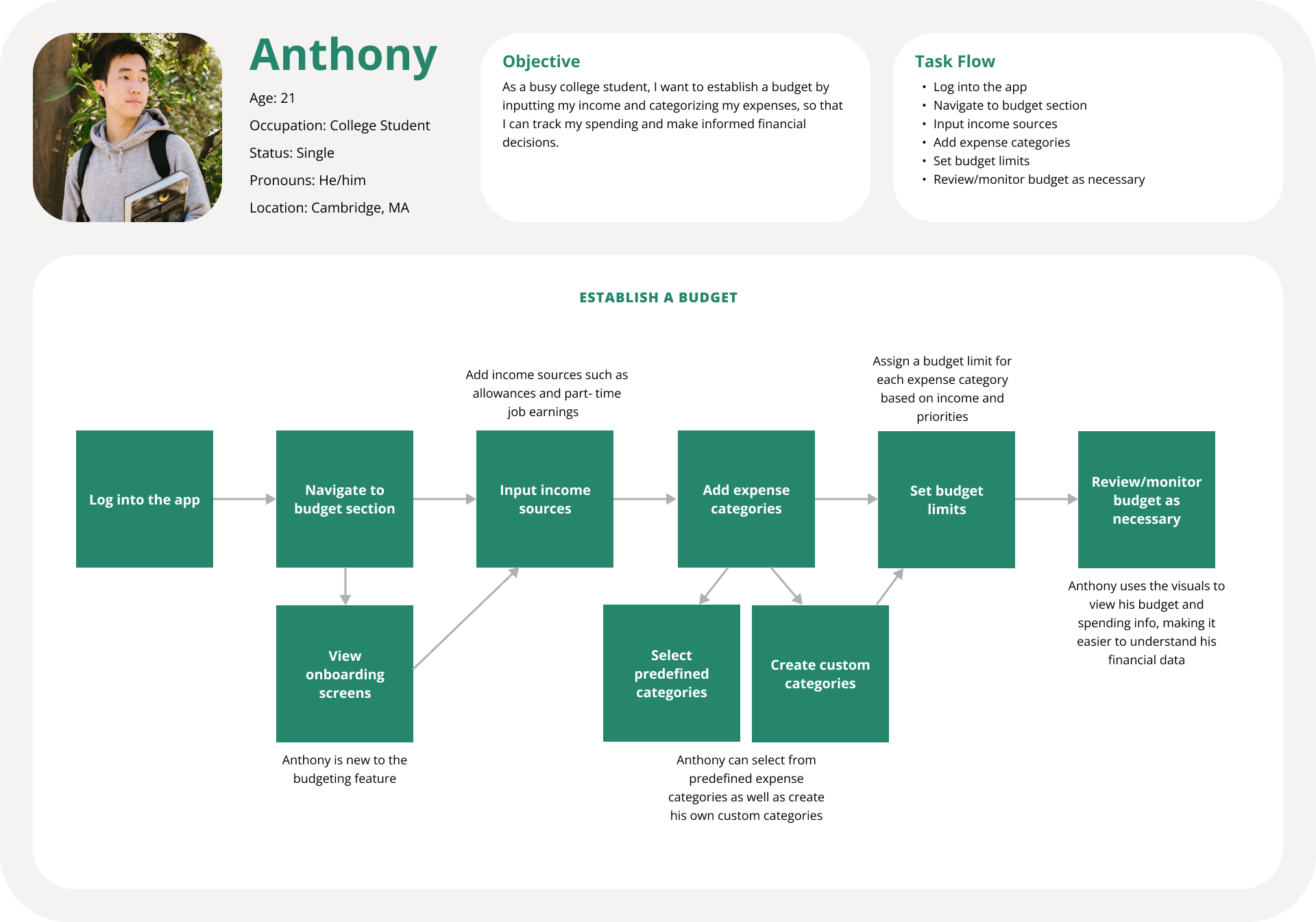
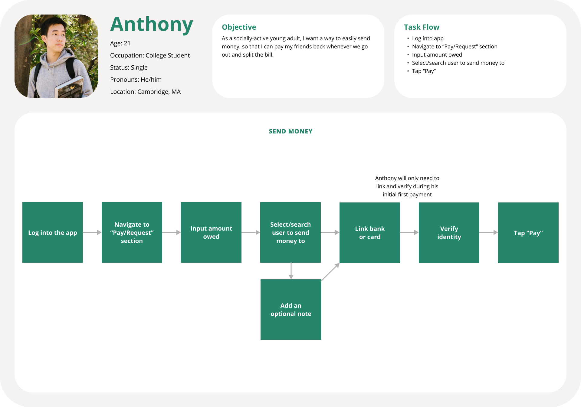
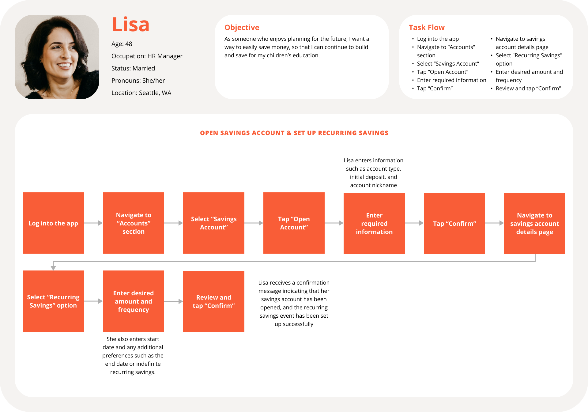
Anthony and Lisa were created to represent key user segments and provide valuable insights into their needs, goals, and preferences regarding PlutoPay.

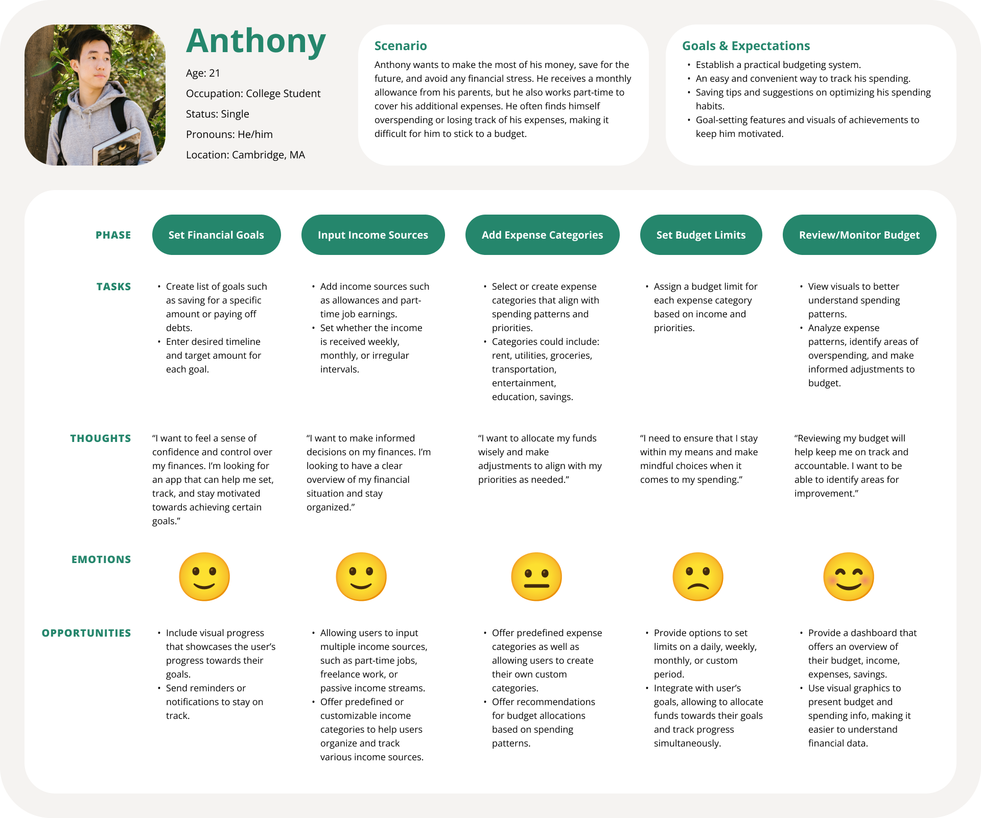
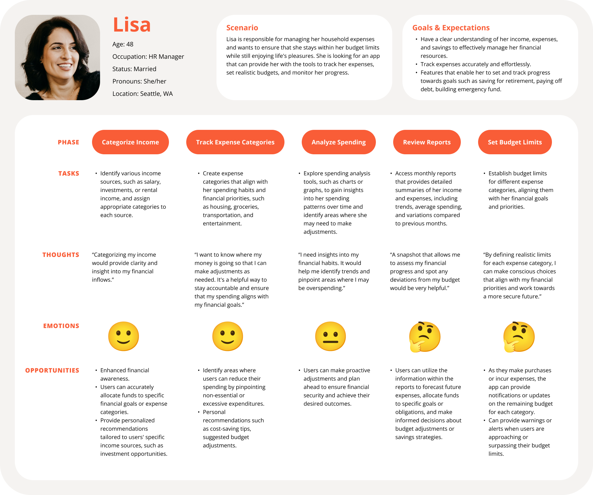
User Journey Maps
Here I mapped out a user journey for Anthony and Lisa to understand the steps they would go through to achieve their key goals.
User Flows
I selected core flows that are key to the user’s experience and tie back to their original goals.
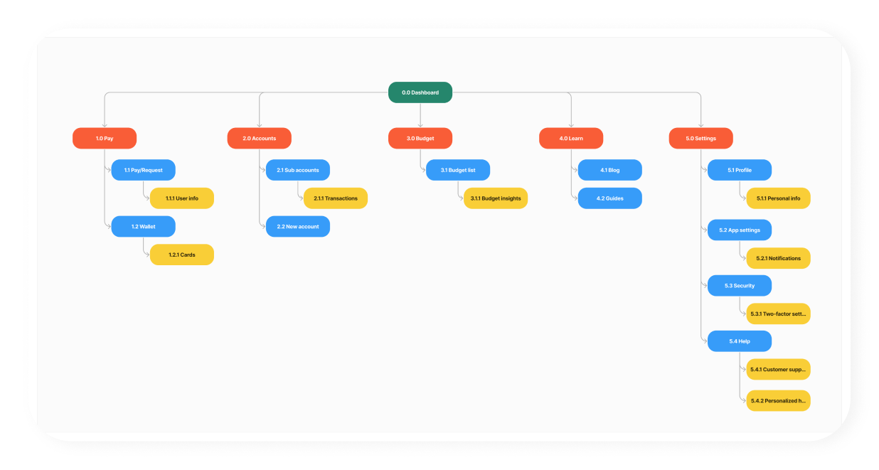
Sitemap
This sitemap was revised upon conducting a closed card sorting test. The main sections of the app are Pay, Accounts, Budget, Learn, and Settings. I believe this is easy to navigate and caters to the needs of our target audience.
Low & Mid-Fidelity Wireframes
These low-fidelity prototypes are a valuable and efficient design tool that allowed me to quickly test and refine ideas, gather feedback, and ensure that the final product delivers a positive user experience.
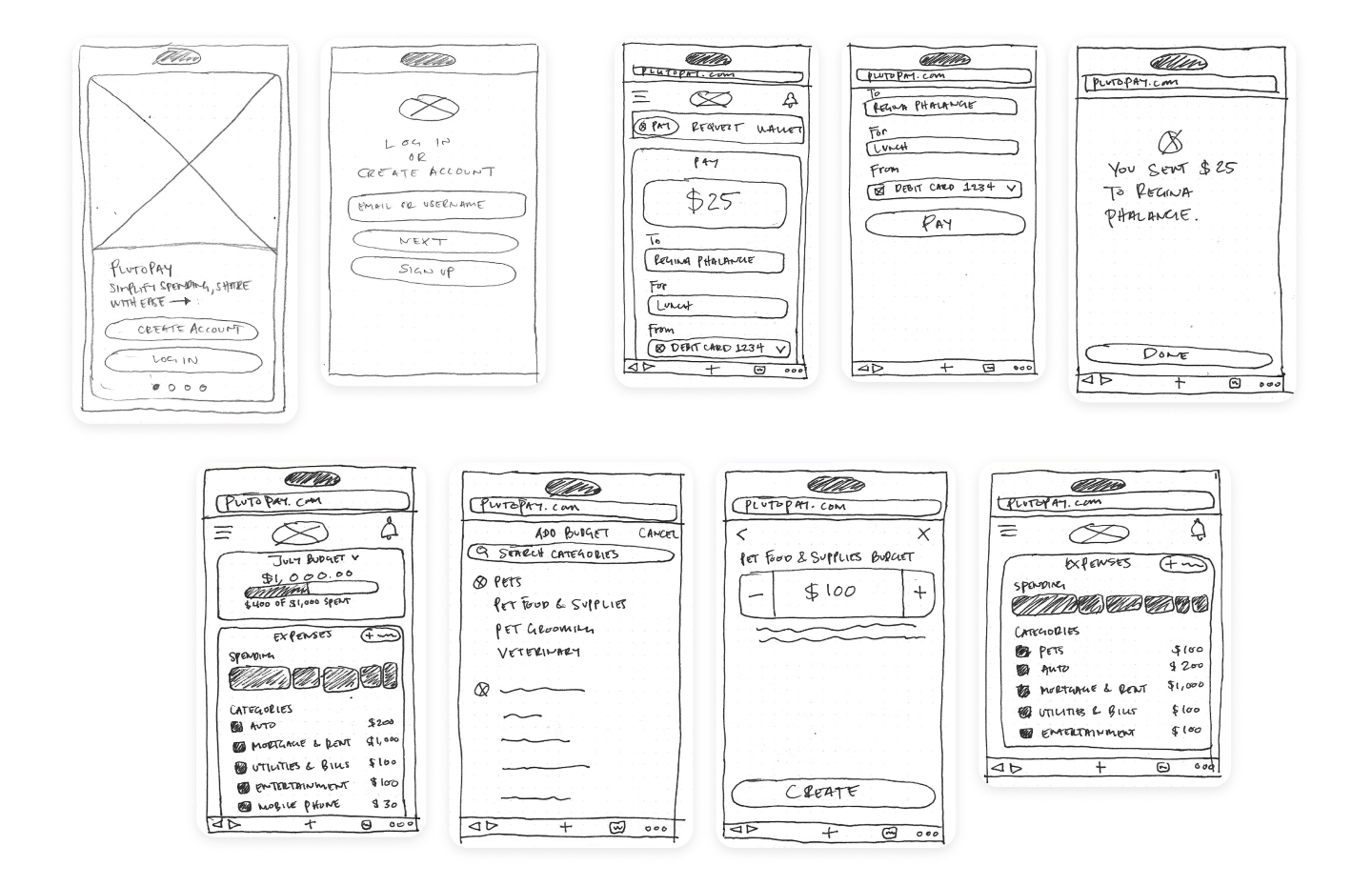
Mid-fidelity prototypes strike a balance between low and high fidelity, offering a practical compromise in terms of design detail, iteration speed, and resource allocation.
Usability Testing & Iterations
The goal of this study was to assess the learnability for new users interacting with PlutoPay for the first time on mobile. I observed and measured if users understood the app, its value, and how to complete basic functions such as sending money, adding a new budget, and creating recurring savings.
For the PlutoPay usability tests, I recruited six participants. Upon reviewing the recorded sessions, I took notes and sorted them into an affinity map utilizing the categories observations, errors, positive quotes, and negative quotes. I organized all the data into a rainbow spreadsheet, listed the top issues within the PlutoPay app, and provided potential improvements.
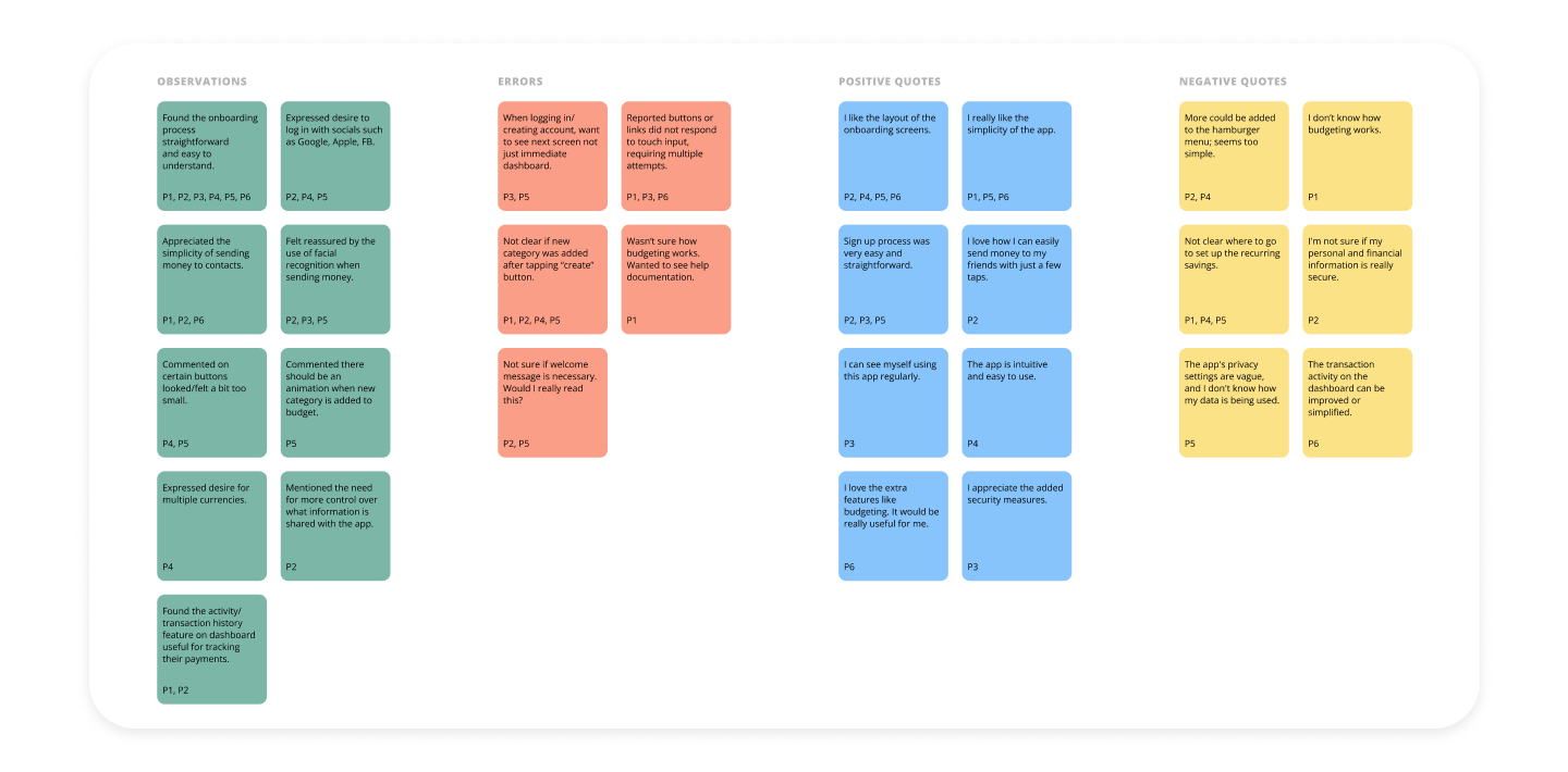
ISSUES & IMPROVEMENTS
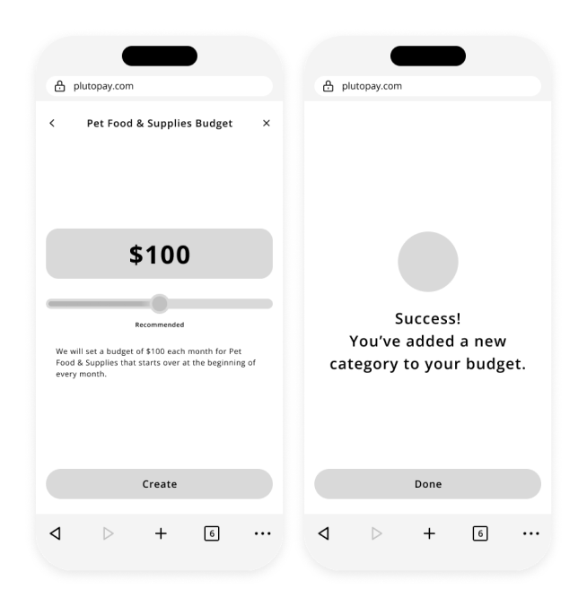
Not clear if new category was added to budget after tapping “create” button.
Suggested change: Create some sort of indication that the new category was added to your budget such as an animation and/or confirmation screen.
Not sure how budgeting works. Wanted to see help documentation.
Suggested change: Include an icon or link that takes users to “Learn” section in case they forget the purpose of budgeting.
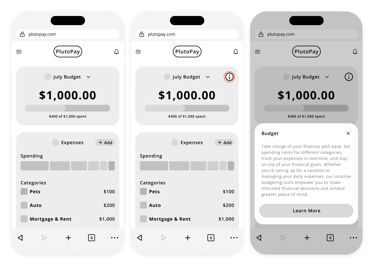
Unsure if welcome message is necessary. Would I really read this?
Suggested change: Include different information upon landing on dashboard. Or have a short welcome message.

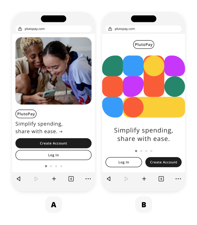
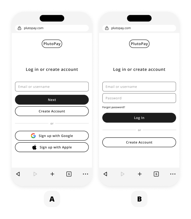
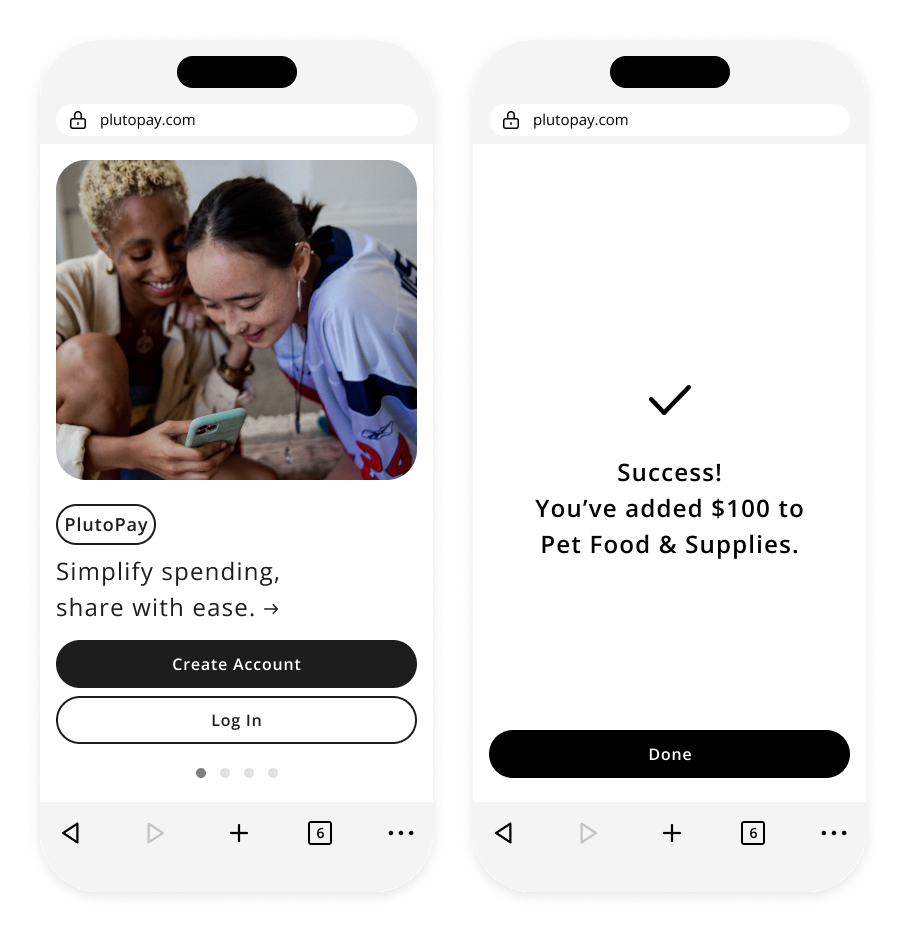
PREFERENCE TEST
A/B tests were conducted for onboarding and log in/create account pages. I ultimately decided to go with the majority consensus and continue to use the original design (A) for onboarding and use the second option (B) for the log in/create account page. This design feels more streamlined and the comment about "creating an account would only be helpful once" really stood out to me.
Design System
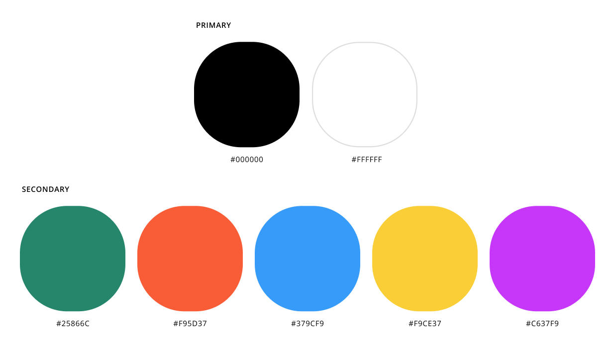
COLOR
To keep a minimal aesthetic, PlutoPay utilizes black and white as primary colors. Secondary colors are bright and playful and are used sparingly throughout the product, such as for default user photo and for budgeting UI elements.
COMMON UI ELEMENTS
Common UI elements utilized within the PlutoPay application. Everything from cards, buttons, carousels, modal windows, and progress indicators.
LANGUAGE/TONE OF VOICE
Language in PlutoPay should be clear and straightforward so that it is easy for users to understand. Avoid jargon or complex financial terms that may confuse users.
Our tone is approachable and friendly. Authenticity is a key component of approachability. Avoid using overly scripted or insincere language. Use the active voice to make your communication more direct and engaging.
ACCESSIBILITY
• Avoid using color as the sole means of conveying information or functionality.
• Ensure that interactive elements and buttons are of sufficient size to be easily tapped.
• Provide adequate spacing between touch targets to reduce accidental taps.
• Make sure app is responsive and adapts to different screen sizes and orientations.
• Involve users with disabilities in usability testing and gather feedback to improve accessibility.
• Adhere to accessibility standards such as WCAG (Web Content Accessibility Guidelines).
GRIDS/LAYOUTS
PlutoPay uses a 4-column grid on mobile with 16px margins and gutters. On desktop, we use a 12-column grid with 24px margins and gutters.
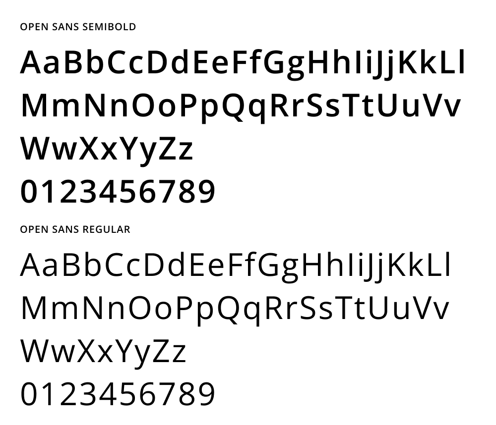
TYPOGRAPHY
PlutoPay uses the sans-serif typeface, Open Sans. This font offers a clean and modern aesthetic, making it easy on the eyes and highly readable on various screen sizes and resolutions. Hierarchy is achieved through variations in size and weight.
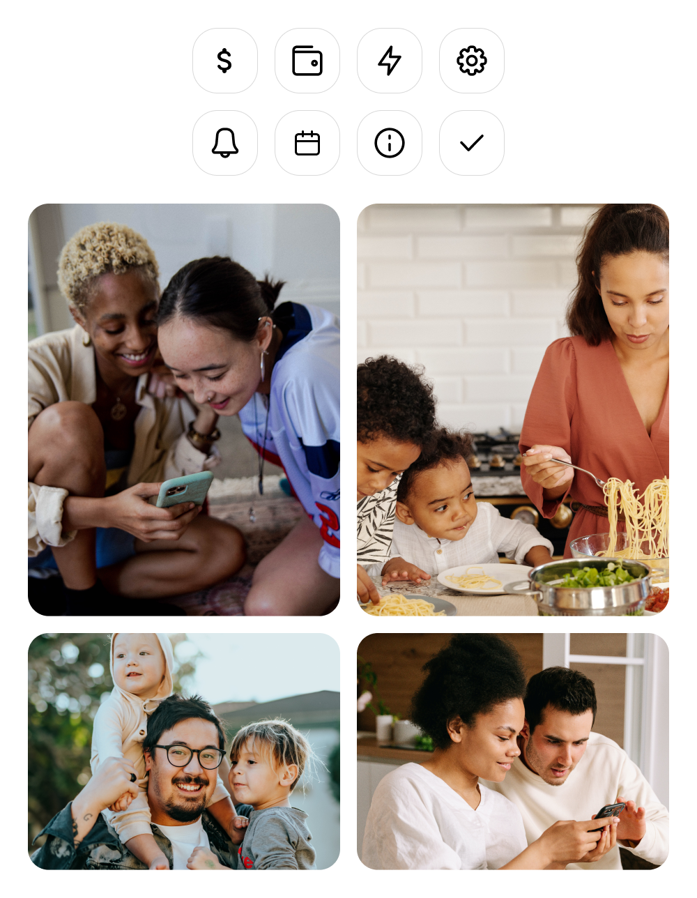
ICONS/IMAGERY
PlutoPay uses stroke style iconography with rounded edges. Our imagery is human-focused, friendly, and fun to help create a positive and engaging user experience.
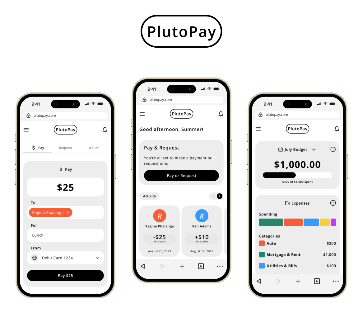
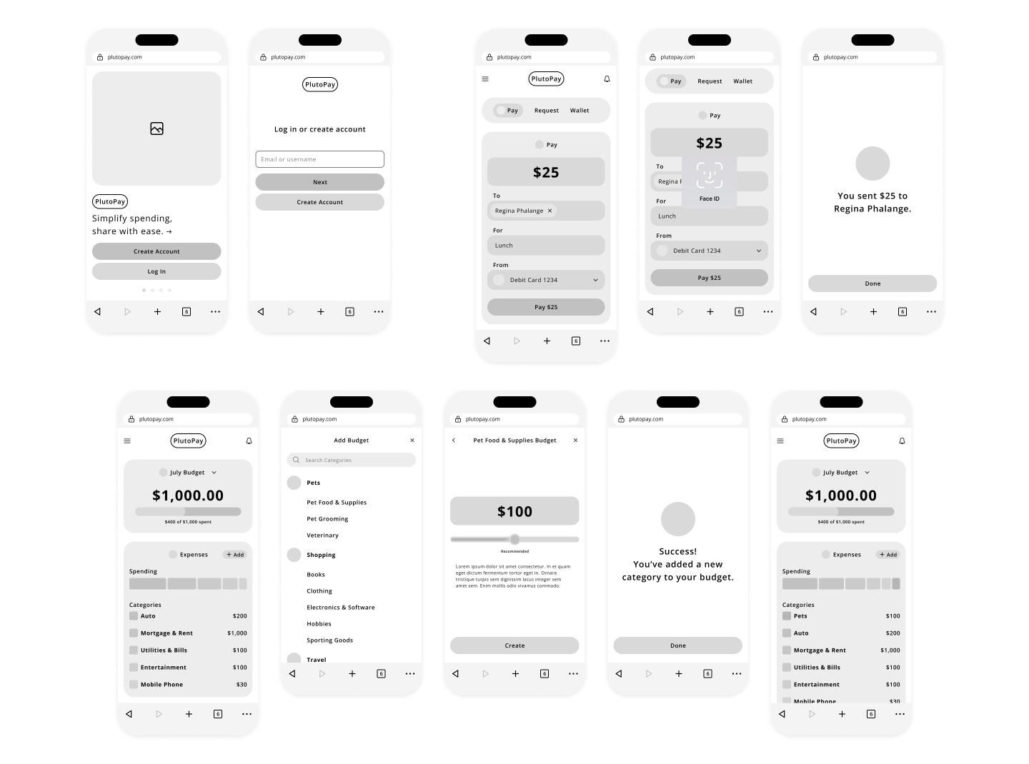
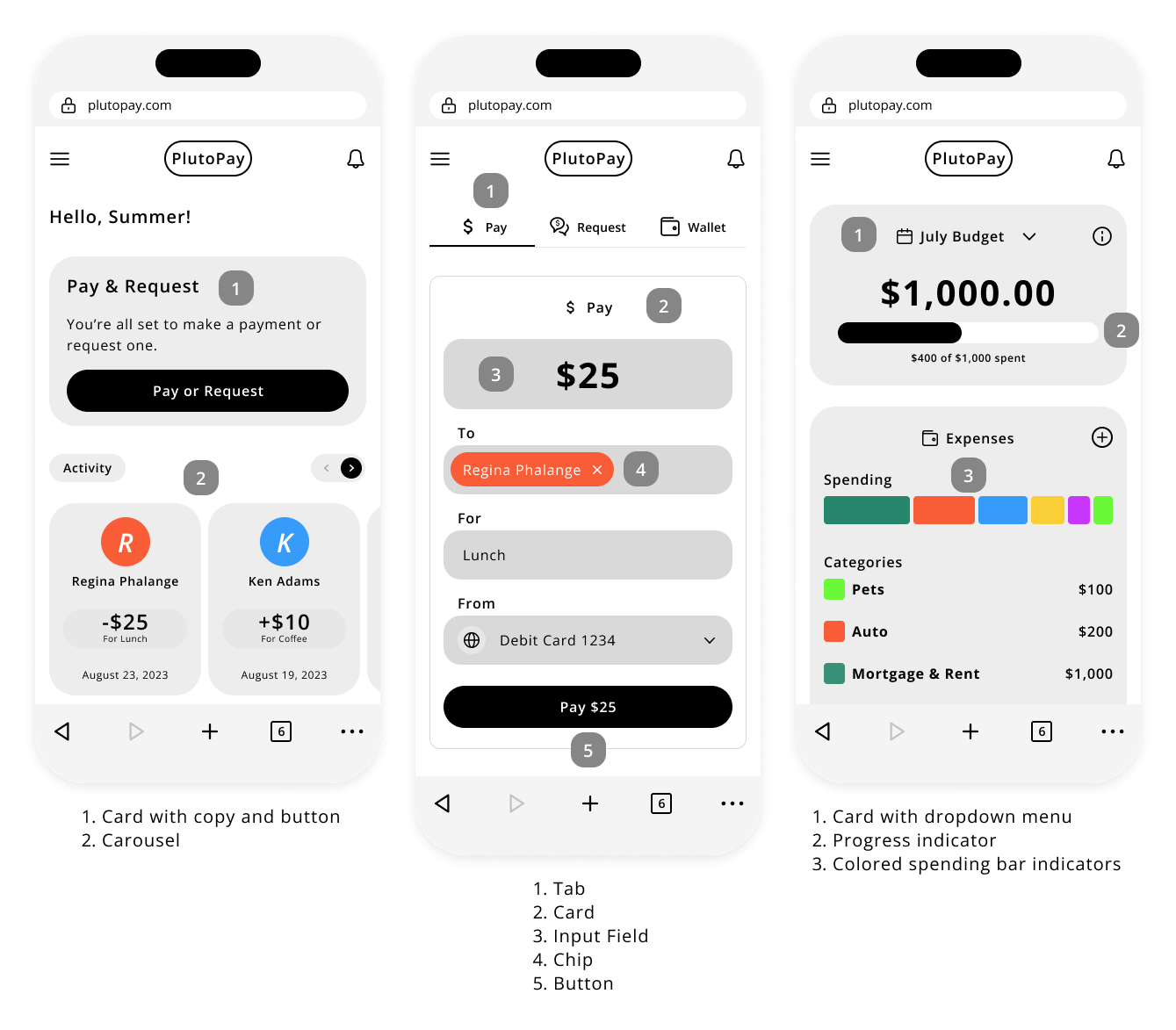
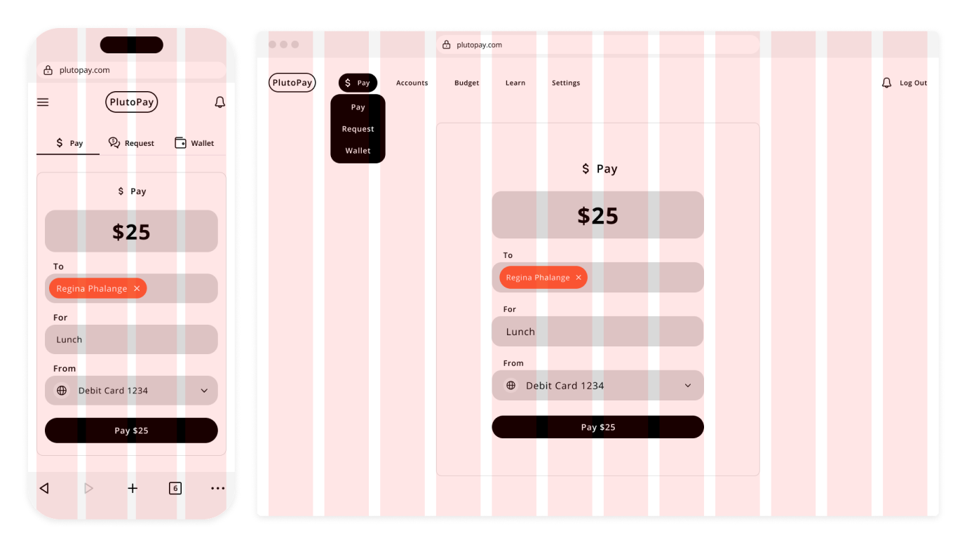
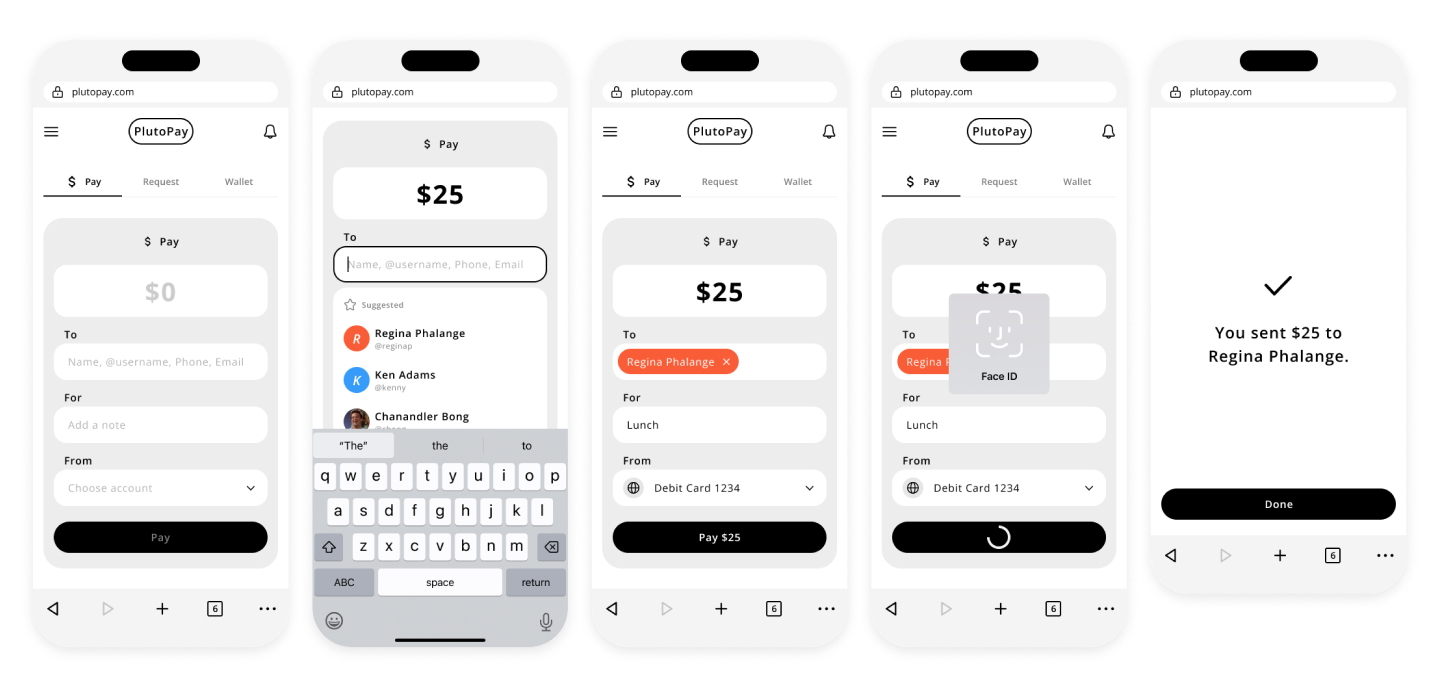
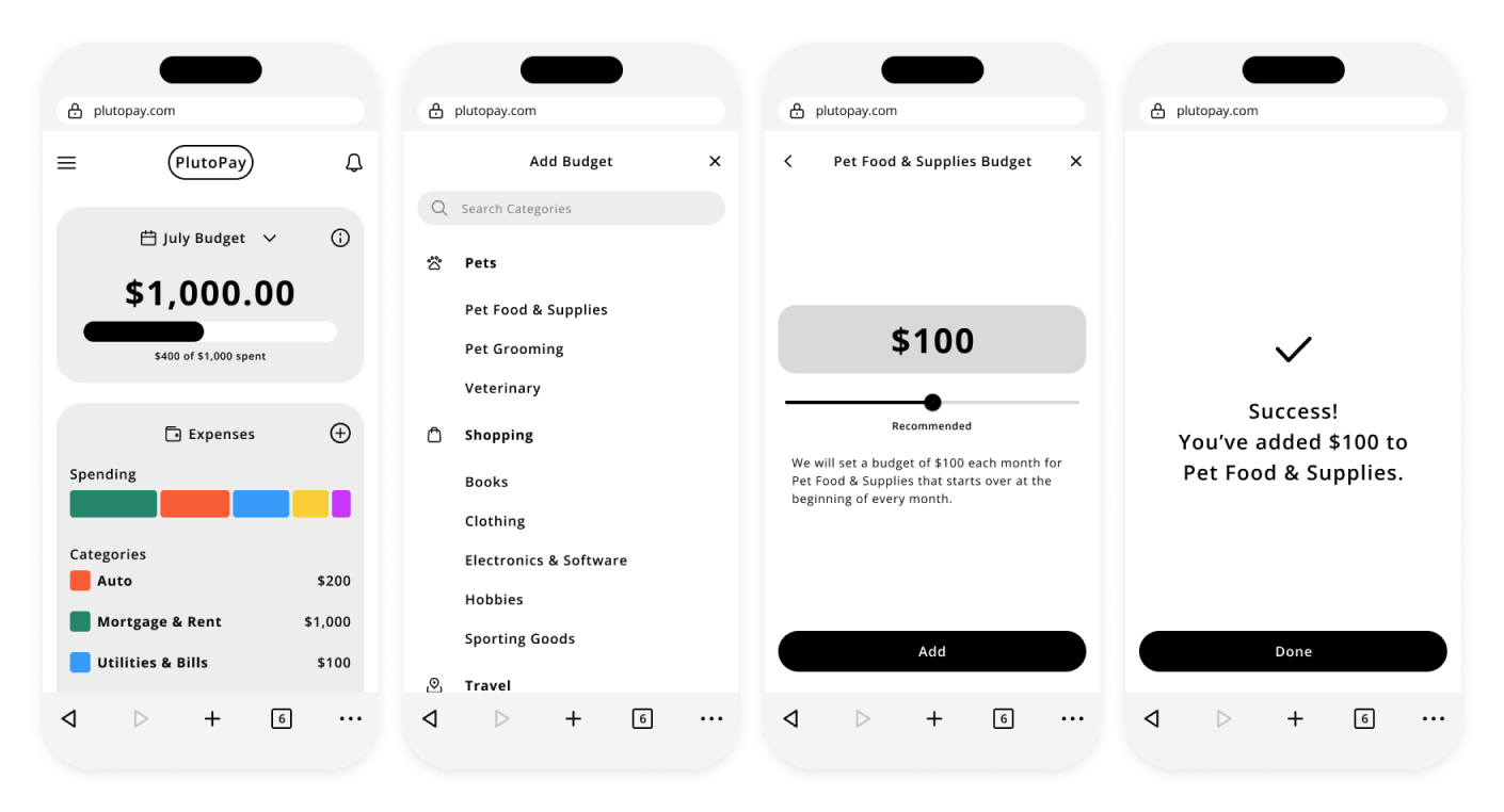
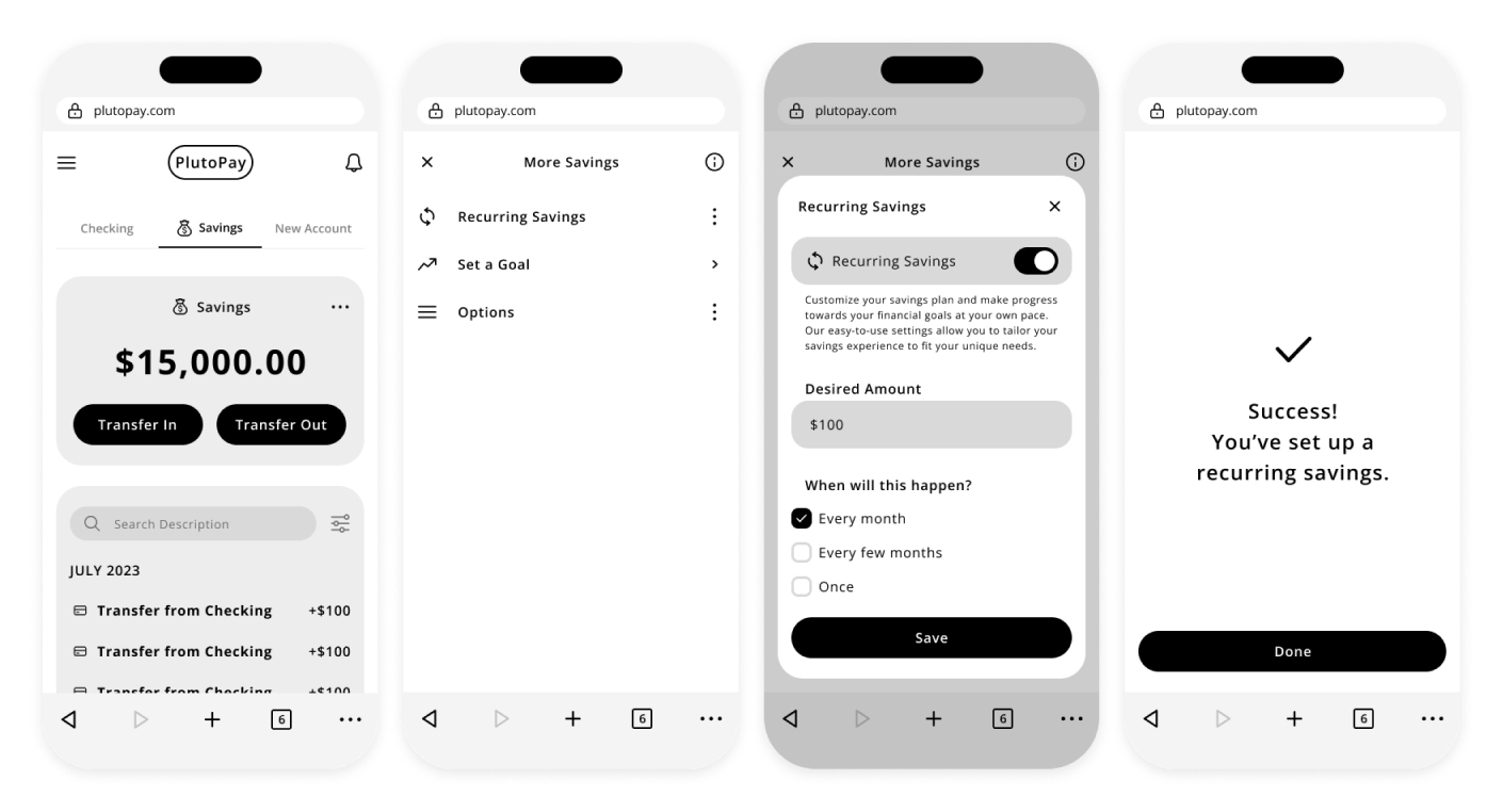
High-Fidelity Wireframes
Below are high-fidelity wireframes for the key features of PlutoPay, providing an in-depth look at the intuitive design and functionality of the product. These wireframes exemplify the user-centric approach that makes PlutoPay stand out.
SEND MONEY FLOW
ADD NEW BUDGET FLOW
ADD RECURRING SAVINGS FLOW
View prototype →
Wrap-Up
LEARNINGS
• Embrace the iterative design process by actively seeking user feedback and continuously improving the app based on their input
• At each step of the process, ask yourself, “How does this affect the user?”
• Usability is a combination of common sense and research
• Write down key aspects about your designs; it will help your brain connect the problem with how your designs solve it
• Be conscious of the significance of making your app accessible to a wide range of users, including those with disabilities, to promote inclusivity
NEXT STEPS
• Design secondary functions such as Activity, Learn, Settings
• Adapt designs for desktop
• Audit app for any other accessibility issues